Reflecting on insights to improve our own website. Marketing for small companies is very important. We recently decided to overhaul the design of the Marketing Quotes website and thought it’d be an opportunity to go through the process of our site redesign and offer insight into the re-design process which we hope can help other small businesses.
We set about reviewing the current site and were able to make the following findings:
We set about trying to solve these issues in the ways outlined below. For each point we’ve explained why it was an issue for us, and why it might also be an issue you want to address when reviewing your own site.

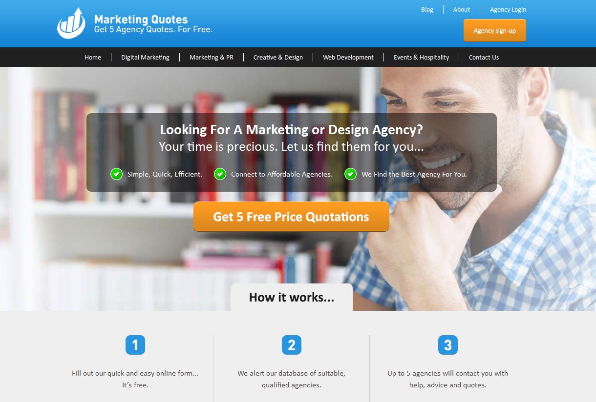
Without clear messaging on what exactly your company offers, it’s easy to dissuade potential customers at the very first hurdle. The image being used on the site offered some information in regard to what a user could potential save ‘by comparing quotes’ but not much in the way of explaining who would be providing the quotes, which is an important factor.

To help overcome this issue we set about redesigning the header using new imagery that draws the user’s eye to a text box containing a bold headline and question for the user. The messaging is uncomplicated and makes it easy for the user to understand what it is Marketing Quotes as a service offers them, without making them overthink.
We also decided to include a CTA at this point to make it even easier for users to begin using the service, when previously the CTA had been fairly well hidden within a form.

It’s important to consider your site and it’s messaging from the point of view of a user who has no idea how your service works. You want to make it as clear as possible to your users, and we felt that the steps we had on the site didn’t fulfil this role as well as they could.
The use of ‘Marketing Services’ didn’t make it entirely clear what services were being offered by Marketing Quotes, and the steps themselves whilst outlining the process, left more questions than they answered in regard to the ‘providers’.
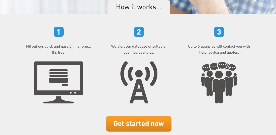
We decided to move the ‘how it works’ steps below the re-designed header image to improve the flow of user experience. Once the user has established what it is Marketing Quotes do from the header, they can then find out how the service works in simple steps without having to search for the answer.
We also made the website much more mobile friendly, which is important these days.
For each step, we improved the messaging to make it easier to understand and clearly outline what to expect at each stage of the order process.
We also included another clear CTA hear that allows the user to start the process easily by being taken directly to the form once they’re aware of the steps.

Web design is itself a subjective element of any site, but is not something that should be overlooked. Insights to improve design are essential as an old design can look, well, old. A user who lands on a page that looks outdated and unmaintained is a lot less likely to want to engage and use the site than if they land on a page that looks like it’s been updated and is well maintained. It’s easier to think of your site in the same way you’d think of a shop window on a high street, you wouldn’t want to let your displays, windows and signage become outdated or irrelevant, and the same applies online.
The old Marketing Quotes site featured a number of stock images that looked outdated, whilst also employing techniques that gave a sense that the site doesn’t receive much attention, which wasn’t the case.
Ultimately the look and feel of the site were both updated to bring it more in line with current web design techniques along with the whole layout going through elemental changes to not only update the site’s look but also to address the issues as outlined in this article.
Undertaking a site redesign gave us a good opportunity to address issues that were present on the site which could’ve negatively affected our conversions and the ability for users to engage with the site. Even if a full site redesign isn’t possible, there’s plenty of smaller changes you can make which can dramatically improve your site and service performance.
Don’t wait until you’re desperate to find a solution, instead focus on incremental improvements and testing to find what works best for you and your business and your site.
Behind the scenes, coding works to ensure CSS works, HTM code needs updated and all linked to Google Analytics with needs regular updates.
Insights to improve technology always need updates. Plugins, need updating and all needs to run smoothly for search engines to correctly index.
Choosing a marketing company to overhaul your website is going to be a challenge, as there so many in the UK to choose from.
We want to help your find the ‘right’ marketing company for your business.


